A bus travel platform’s seat pricing map is core to how customers choose and pay for their seat.
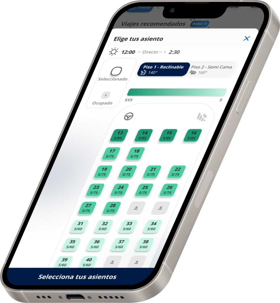
This case study covers the redesign of how seat prices were displayed. Moving from a single “starting price” to a transparent, zone-based systemwhere users can clearly understand the different rates.
The initiative addressed both a user need for pricing clarity and a business need to introduce revenue management.
Tools
Figma
Hotjar
Claude
Mixpanel
Role
Lead Product Designer
Problem
Where the price stopped making sense for users
Through Hotjar, comments began to come in from users expressing discomfort and confusion, noting that the price they saw was not the same as what they ended up paying.
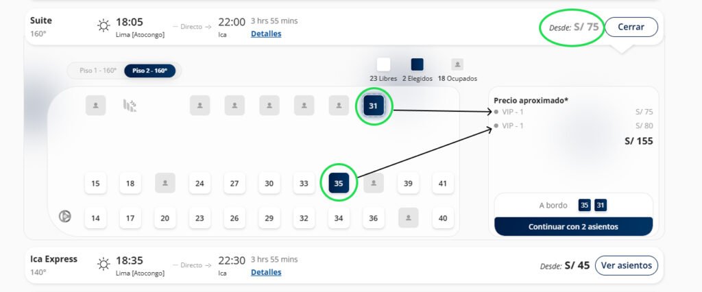
The schedule screen displayed a starting price, for example, “starting at $75”, but that price applied only to the cheapest seat on the bus; it wasn’t a flat rate for all seats. When a user selected a seat on the upper deck or switched to a different seat, the price would increase.
This caused users to lose trust in the product, which was a critical issue that needed to be addressed.
Additionally, the company was developing a pricing strategy for seats, which made this problem a business priority as well.
A user issue and a business need that both pointed toward the same redesign.
Objetives
Experience for Users
Show a real, trustworthy seat price at the moment of selection
Eliminate price surprises between the schedule list and checkout
Communicate zone-based pricing clearly, without feeling deceptive
Business
Support the rollout of zone-based revenue management
Maintain user trust in displayed pricing
Reduce complaints tied to pricing confusion
Methodological Approach
Iterative Validation
We decided to iterate quickly rather than wait for absolute certainty.
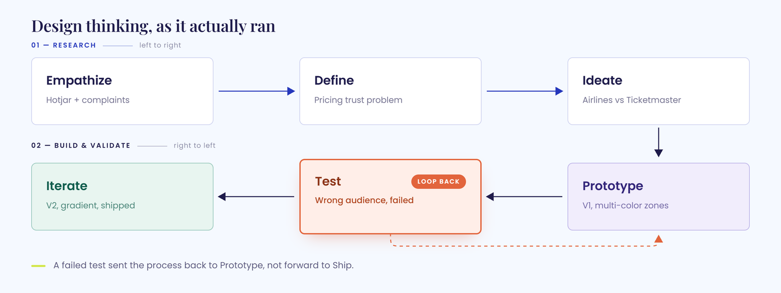
We launched a V1 that, in theory, addressed the business need—to show that a bus can have multiple fares. But when we reviewed actual user behavior using Hotjar—not just the team’s opinions—we realized that users were still confused.
That’s when we realized we’d validated with the wrong audience.
So we redesigned based on how users actually interacted with the feature, and this second version did reduce the confusion.
Benchmark | Research
Learning from other seat maps
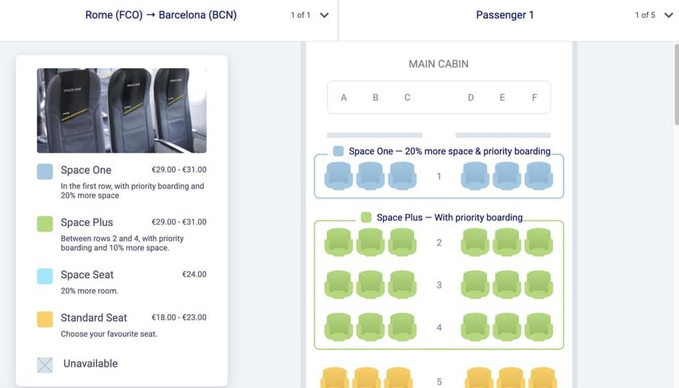
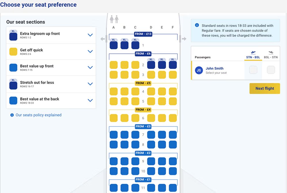
As part of the research phase, I looked at how airlines handle seat-based pricing, a common reference point in product design when tackling pricing and categorization problems.
Distinct colors per service tier: Premier, Plus, Preferente. Each with its own visual identity
Built to compare packages and perks, not to communicate raw price differences
Worked well for airlines because the seats genuinely offer different things
Our seats weren't different products: it was the same seat at a different price. That distinction defined everything else.
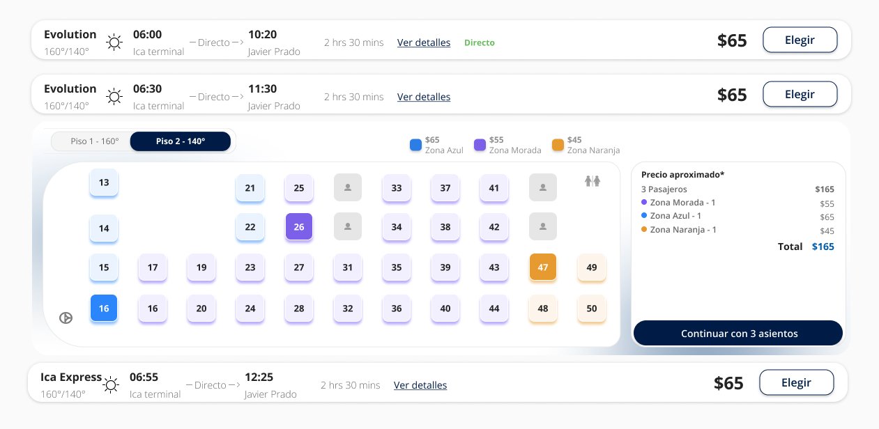
Iteration 1
Good reviews...from the wrong room.
Before launching, we tested it with a small group close to the client’s team, not real end users. The response was positive, so we moved forward assuming the problem was solved.
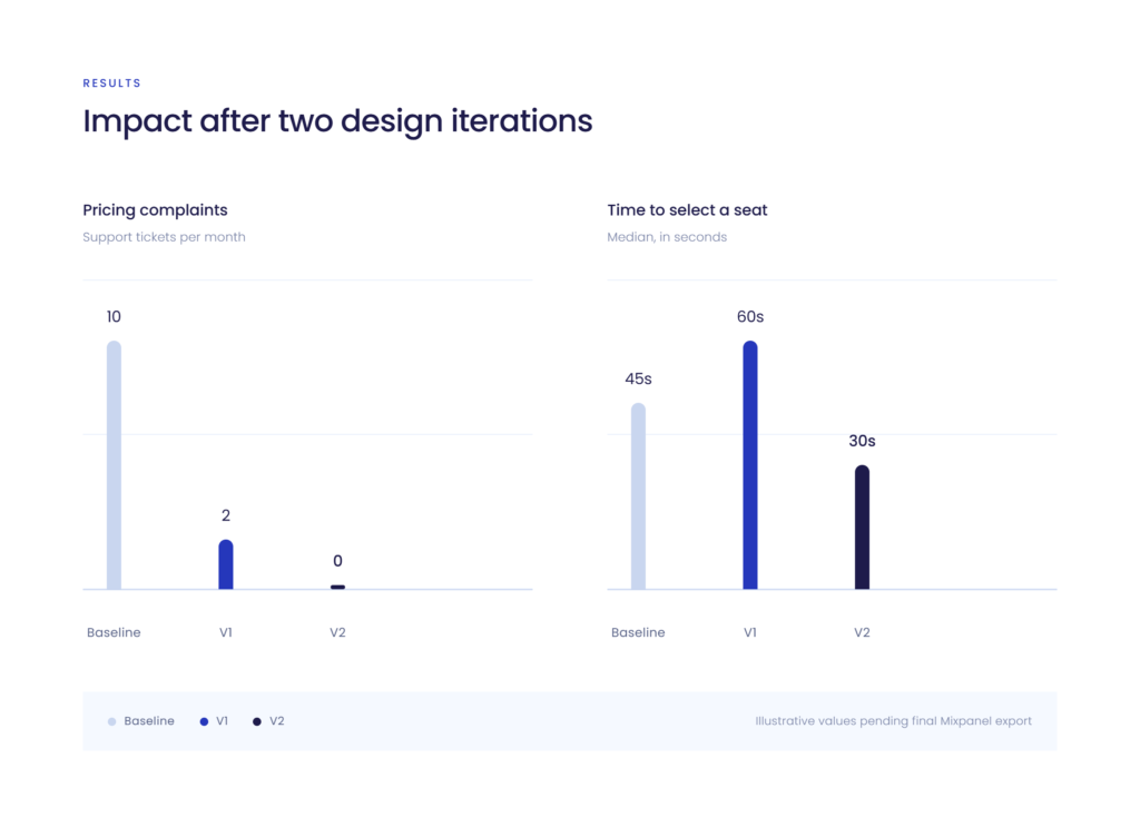
With that validation, we rolled it out as an A/B test on one of the busiest routes. That’s when the real signal showed up: Hotjar recordings showed users on the V1 side kept switching seats, clicking back and forth, still confused. Mixpanel confirmed it — no more pricing complaints, but time-to-select had gone up compared to the control.
The issue wasn’t the color system itself, it was who we’d validated it with. The people we tested with first already understood how it was supposed to work; they weren’t a substitute for someone seeing it for the first time.
Iteration 2
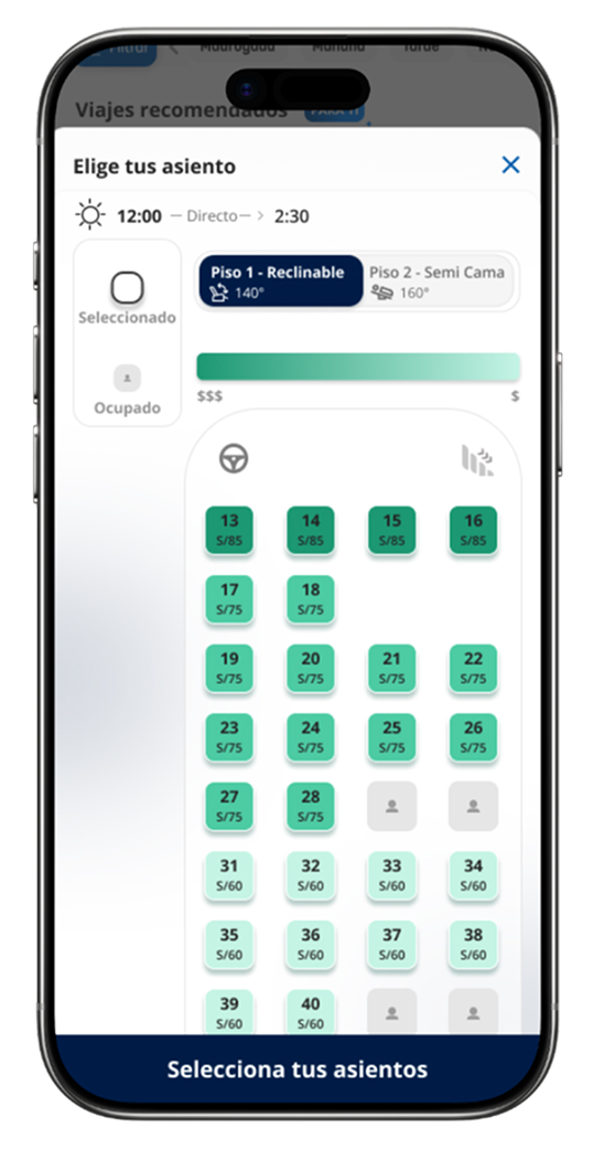
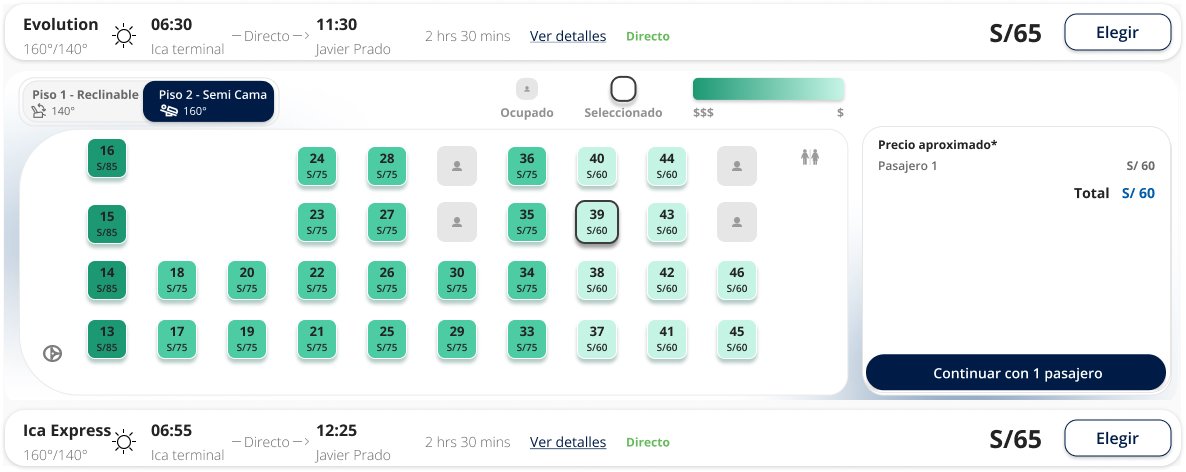
Learning from V1, V2 simplified the color palette down to a single hue: darker seats meant higher prices, lighter seats meant lower prices.
The V1 system asked users to hold three unrelated colors in mind and map each one back to a price in the legend — an extra step that showed up in the data as longer time-to-select.
A gradient within one hue removes that translation step: “darker equals more expensive” is something users feel intuitively, without decoding it.
We also moved the price onto every seat directly, instead of keeping it isolated in the legend. That removed the back-and-forth between seat map and color key that was adding friction in V1.
V1 brought complaints down slightly, but Hotjar recordings showed users were still confused — the underlying problem hadn’t actually been solved.
V2 launched as an A/B test on one of the platform’s highest-traffic routes. Against the control, complaints dropped further, and Mixpanel showed users selecting a seat measurably faster than before.
A small window of time on its own, but it was the exact step we were trying to unblock, and it held consistently across the test.
What i learned
Feedback from the wrong room isn’t validation Positive reactions from people close to the business aren’t a substitute for real users. The biggest shift in this project was learning to distrust “it looks fine” from anyone who wasn’t the person actually buying a ticket.
Simpler almost always wins Five colors felt like more information. One gradient turned out to be more information, delivered in a way people could actually use. Adding clarity sometimes means removing choices, not adding them.
A/B testing is where assumptions actually get checked Internal approval told us we were on the right track. It took a real traffic test against a control to confirm it.